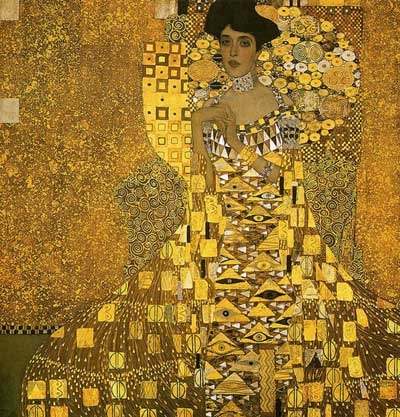
This is an artwork by the artist Gustav Klimt. All of his artworks, including this one were made with metallic paints, so the colors really pop out. A lot of his artworks use very similar colors with the subject and the background, mainly different colors that all meld well together to create the artwork. A lot of his artworks feature great examples of style.
This is an artwork I found by Dave Pollot, Dave Pollot inserts pop culture characters into thrift store paintings. I found this one and really enjoyed it, it features a very nice looking scene, with a very contrasting Cthulhu head coming out of the river. The colors surprisingly blend well together.
This is an artwork created by aprilschumacher. It features this bear wearing a Ushanka and some communist clothers.. I really like the monochromatic color scheme, really only being red, white, and a bit of yellow. The level of detail on the bear itself is very simplistic but with a bit of realism mixed into it.
This is an artwork I made myself, it features the three fathers of communism, Josef Stalin, Vladimir Lenin, and Karl Marx. I really like the monochromatic color scheme, really only being red, white, and a bit of yellow. This is for the Complex assignment, and it is very complex. Especially with all the gradient changing to create the red and white color scheme on everything.
This is an artwork by the very popular artist BenCab. All of his artworks, including this one are very symbolic and usually have a deep meaning. A lot of his artworks use very contrasting colors with the subject and the background, mainly different colors that all meld well together to create the artwork. A lot of his artworks feature great examples of style He also takes a very simple approach when making this artwork.
Weeks 4-8
I gave Nathan a 6/10 I gave Kurt a 4/10 Angelo gave me an 8/10 Kurt gave me a 7/10 SA I gave Nathan 8/10 I gave Kurt a 4/10 Angelo gave me a 10/10 Kurt gave me a 10/10 This is another art piece by the artist and writer Alexius. This is an image from the web-comic Romantically Apocalyptic. I really like the artworks done for the comic, mainly for the large use of color contrast, especially with the color red. The red color always contrasts well with the usually dark background, and provides some vibrancy to the artworks. I've noticed that there is always one color that is very bright unlike the rest of the artwork, usually the color red.
This is another fan-art made by Harry Osborn of the game Dark Souls. This artwork makes the game seem a lot more epic then how you really are in the game, which is usually mildly depressing. So the part I really like about this artwork is the very vibrant use of color and the contrast the fire creates with the dark tree creature and background. It also creates a comic-book like effect on the scene.
|
ArtistConnor is an experienced Computer Artist. Archives
May 2018
Categories |